5 Unique Paint Colors That Instantly Elevate Your Home in 2025
Sometimes a room feels unfinished, even when all the furniture and decor are exactly where they should be. Everything should work — but something’s missing. More often than not, it comes down to the walls. The paint color might be too flat, too cold, or just too safe.
Designers know that color does more than decorate — it sets the tone for the entire space. And in 2025, we’re seeing a move away from cool, overused grays and sterile whites. Homeowners and designers alike are reaching for colors that feel warm, rich, and layered — shades that help a space feel intentional and lived-in.
In this article, we’re sharing five standout paint colors that are making waves in real homes. These aren’t just pretty swatches — they’re colors with presence. Each one brings something unique to a room, whether it’s quiet depth, soft warmth, or refined contrast. And at the end, you’ll get a simple palette you can use throughout your home to make everything feel more pulled together — without the guesswork.
Sherwin-Williams Shiitake (SW 9173)
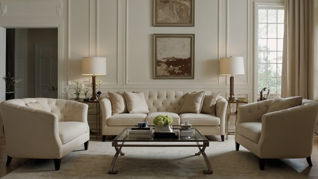
Shiitake is the color you choose when beige is too bland and gray feels too cold. This soft mushroom taupe sits right in the middle — warm, organic, and quietly refined. It doesn’t shout for attention, but it makes everything around it feel more intentional.
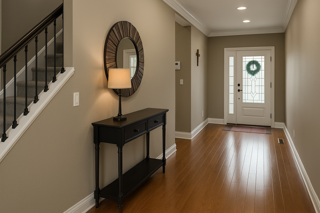
Best used in: In a hallway, bedroom, or living room that feels a bit too plain or stark. It’s perfect when you want a gentle neutral that still brings a sense of warmth and design intention.
Style tip: Pair Shiitake with light oak floors, creamy fabrics, and matte black accents. It also looks gorgeous with textured neutrals like linen, cane, and raw wood. Lighting matters here — warm bulbs (around 2700K) or soft daylight will help it glow without looking dull.
Benjamin Moore Pashmina (AF-100)
Pashmina is one of those shapeshifting neutrals that plays well with just about everything. It leans slightly taupe in warm lighting and more gray in cooler tones, which makes it feel layered and rich — not flat like many medium neutrals.
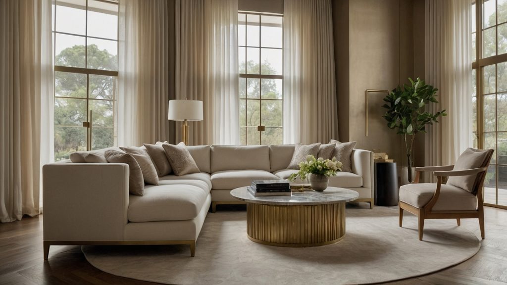
Use it for: Accent walls, built-ins, or rooms that need a cozy but elevated touch — like a home office, reading nook, or entryway.
Designer favorites to pair: Crisp white trim (like BM Chantilly Lace), warm bronze lighting, and textured fabrics in oatmeal, charcoal, or camel.
Pro tip: If your room doesn’t get much sunlight, don’t pair Pashmina with cool-toned furniture. Use warm textures instead to bring out its richness.
Farrow & Ball Card Room Green (No. 79)
This muted, historic green has a touch of blue and gray that keeps it elegant — not trendy or bold. Card Room Green feels timeless, like it belongs in both a cozy cottage and a modern brownstone. It’s the kind of color that tells a story.
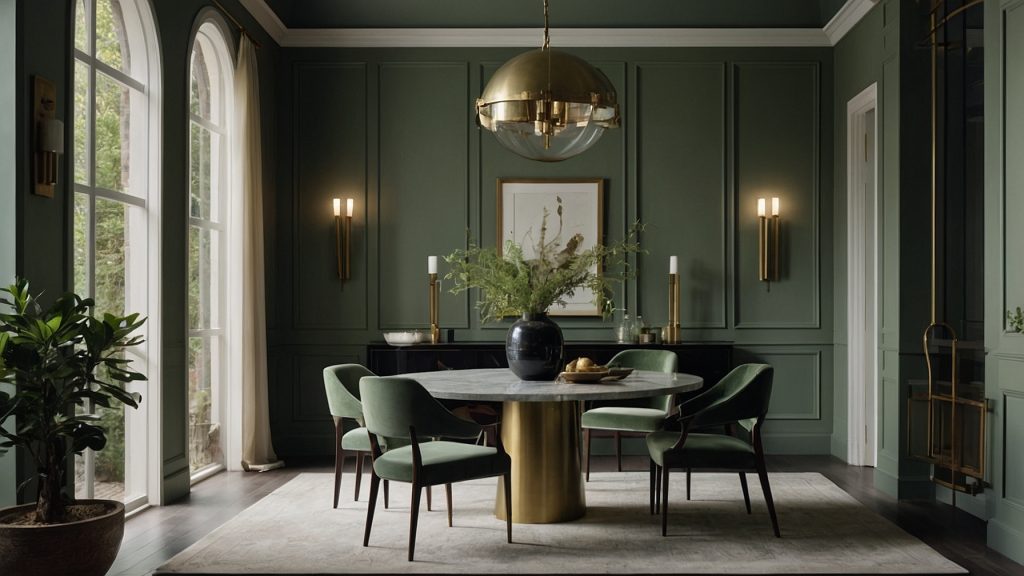
Where to use it: Dining rooms, guest bedrooms, home libraries, or cabinetry. It’s also beautiful in powder rooms or on the back of built-in shelves.
Styling ideas: Try it with ivory walls, natural oak, and touches of brass or copper. Add layered textures like boucle chairs, woven shades, or vintage frames. Warm, soft lighting makes it feel richer and more lived-in.
Sherwin-Williams Urbane Bronze (SW 7048)
Urbane Bronze is not just a statement color — it’s a grounding force in any space. This bronzy charcoal brings structure, depth, and contrast while staying warm thanks to its brown undertone. It doesn’t overpower a room, it defines it.
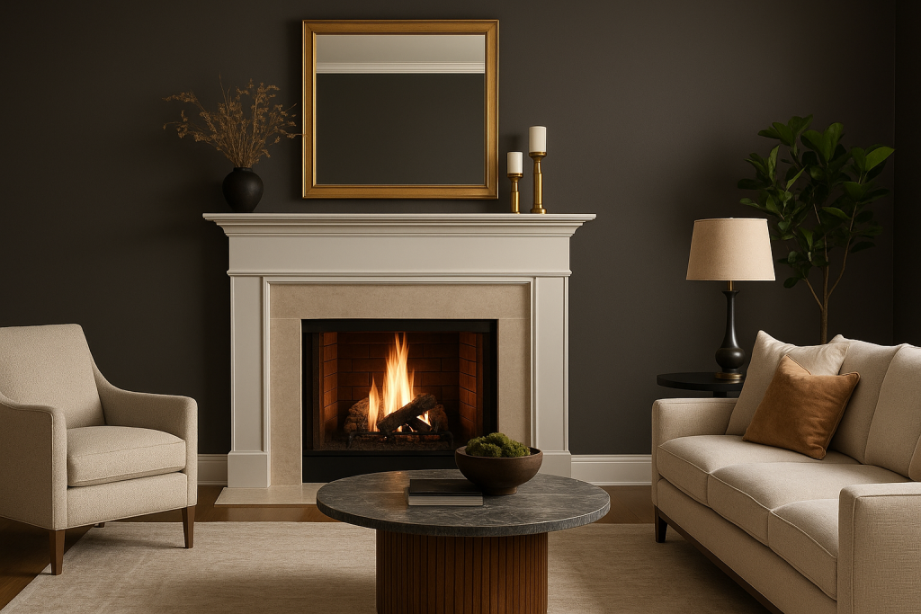
Where it shines: Kitchen islands, fireplace surrounds, bathroom vanities, or exterior doors. It’s ideal when you want one element to stand out and feel sculptural.
Balance it with: Lighter countertops, creamy walls, warm wood cabinetry, or soft beige upholstery. Brass or aged gold hardware enhances its warmth beautifully.
Lighting tip: Use it in rooms with ample natural light or layered artificial lighting — overhead, accent, and task lighting will keep it cozy instead of cavernous.
Behr Smoky White (BWC-13)
If you’ve been hunting for an off-white that doesn’t feel sterile, Smoky White is your answer. With the gentlest beige undertone, it creates that airy, open feeling without looking cold or flat.
Where it works beautifully: In open-concept homes, small rooms that need brightness, or anywhere you want a clean but warm foundation. It’s also a great ceiling color if you want something softer than stark white.
Pair it with: Just about anything — light wood floors, rattan furniture, sage green accents, or deeper neutrals like Pashmina. It plays well with cool and warm palettes alike.
Why I love it: It’s an excellent starting point for a whole-home palette, especially if you want flexibility but don’t want to repaint in two years.
How to Turn These Into a Whole-Home Palette
Now let’s bring it all together. If you want your home to feel thoughtful and cohesive, these three shades are the dream team:
- Main color: Behr Smoky White — use it for most walls to keep your spaces light and welcoming.
- Accent color: Farrow & Ball Card Room Green — add it to cabinetry, niche walls, or even furniture for a subtle layer of color.
- Depth color: Benjamin Moore Pashmina — perfect for rooms that need a cozy, intimate atmosphere.
How to flow it through your house:
Start with Smoky White in shared spaces like your living room and hallway. Let Card Room Green make a quiet statement in the dining area or home office. Use Pashmina in your bedroom, guest room, or even a transitional hallway to add contrast.
This palette balances warmth, contrast, and livability — and it won’t feel trendy in a year.
Final Thoughts: When Your Home Feels “Almost There” — Start With Paint
If your space feels 80% done but not quite right, paint might be the missing piece. It’s the least expensive way to completely change the mood of a room.
These five shades are the kinds of colors designers go back to again and again because they don’t just look good — they make the whole space feel pulled together.
3 Comments
Pingback:
Pingback:
Pingback: