4 Unexpected Color Combos That Actually Look Amazing in Real Rooms
When it comes to decorating, most of us stick with safe colors. But sometimes, the best results come from trying something bold and unexpected. These four color combinations might sound strange at first, but when used the right way, they can totally change the look and feel of a space.
Let’s break them down, one by one, with tips on how to make them work in real rooms.
1. Mustard Yellow + Deep Teal
This mix is cozy and dramatic, but not too dark. It works great in bedrooms, dining rooms, or even home offices where you want a bold color that still feels livable.
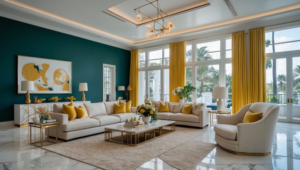
Start with deep teal on one big surface. Think walls, a large bookcase, or even a bed frame. Then bring in mustard yellow in smaller areas like a chair, a pendant light, or artwork. The trick is to let one color take the lead and use the other as an accent.
Try not to put both colors down low in the room (like in rugs or low cabinets). That can make the room feel heavy. Instead, raise one color up—use it in curtains or wall art—to help the space feel taller.
Use dark metals like bronze or matte black, and keep everything else simple and neutral so the colors can shine.
2. Taupe Gray + Deep Red
This combo feels warm and grounded. It’s perfect for entryways, hallways, or dining rooms where you want a space to feel inviting but still put-together.
Paint most of the walls in taupe gray. It’s a soft, calm background that doesn’t feel cold. Then, add dark red in one specific area—maybe a cabinet, a painted door, or a small wall. This gives the room structure without making it too busy.
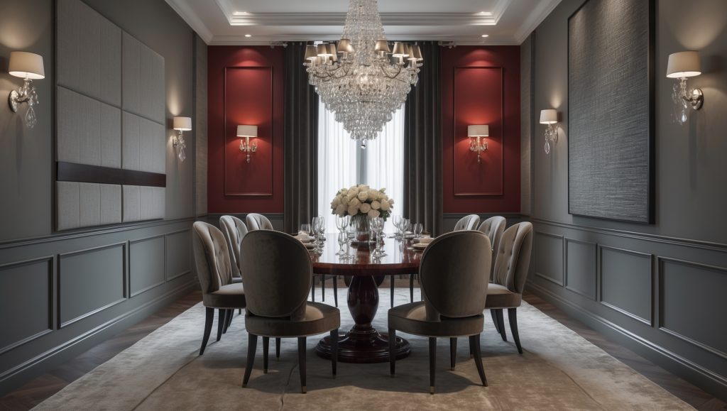
This pairing works best with wood tones like walnut or cherry. For light fixtures or handles, go with antique brass or black. If you want to keep it fresh, try one modern touch, like a clean-lined mirror or a simple light fixture.
Skip glossy finishes or shiny metals. They don’t match the grounded feeling of this combo. Stick with matte textures and cozy fabrics like cotton, linen, or something woven.
3. Bright White + Teal
This one is crisp and clean—great for bathrooms or laundry rooms. It gives the space a fresh feel but still has style.
Use bright white as the main color on walls, ceilings, or cabinets. It reflects light and makes small rooms feel bigger. Then, add pops of teal in just one area—like a vanity, a shelf, or a tiled backsplash.
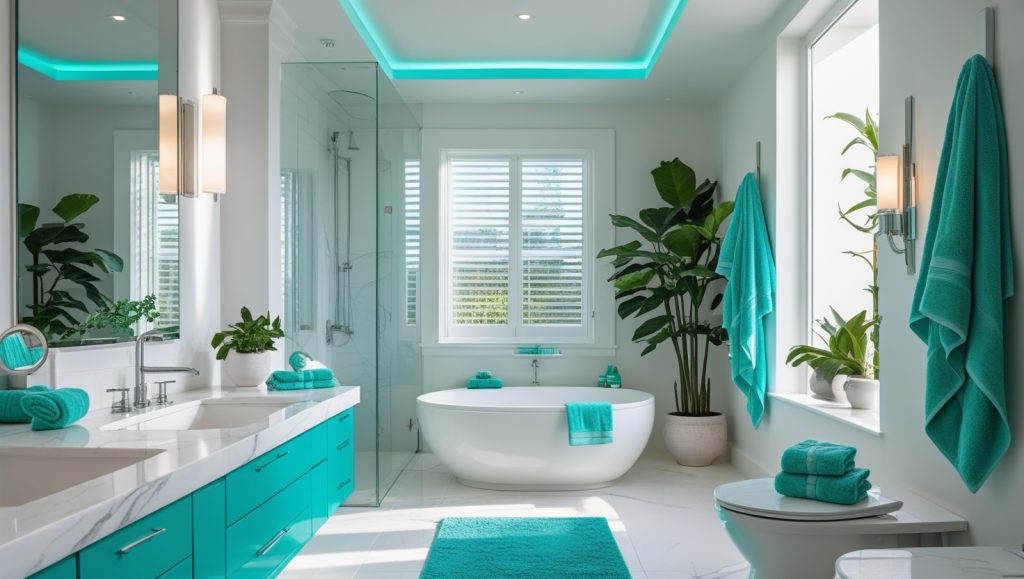
To keep it from feeling too cold, add warm details. Woven baskets, bamboo accents, or a light wood stool help balance out the bright colors.
Avoid gray floors or blue-toned lighting, which can make teal look dull. Instead, use beige tiles or warm white lights to keep the color looking rich and cheerful.
4. Deep Purple + Light Gray
This mix is bold but elegant. It works best in spaces with tall ceilings or simple layouts, like bedrooms or long living rooms.
Use purple in creative ways—try it on the ceiling, or in narrow wall panels or trim. That draws attention without overwhelming the room. Keep the walls light gray to add contrast and make the room feel bright.
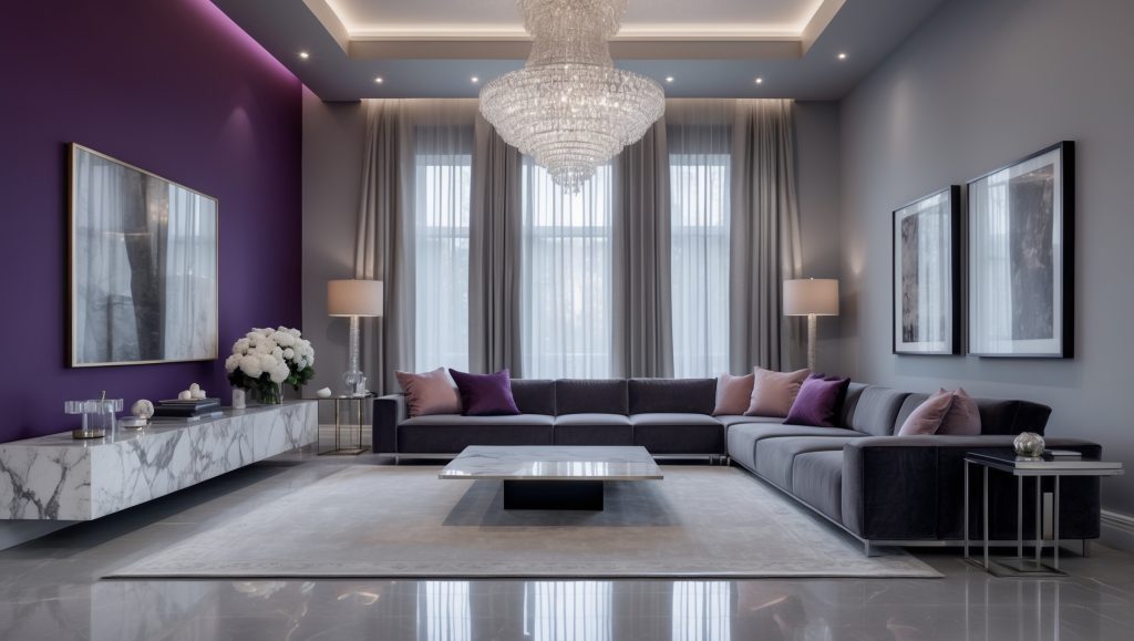
Stick with smooth stone floors in gray tones and avoid warm woods that clash with purple. Use black metal furniture or dark fabrics to add structure.
Lighting matters here. Use soft lamps or sconces that shine upward. This makes the purple feel deeper and richer.
And one last tip: Don’t use both colors in the same finish. If the walls are matte, try glossy or satin for the purple accents. Mixing textures is what gives this combo its polished look.
Final Thoughts
These color combos might sound strange at first, but they actually work when used the right way. The key is to find balance—let one color lead, use the other to support it, and add a mix of textures to keep things interesting.
Want to keep exploring creative color ideas? Check out my blog post on 5 Unique Paint Colors That Instantly Elevate Your Home in 2025 — it’s packed with stylish options that go beyond the usual picks.