Luxury Bathroom Colors: 3 Best Designer Palettes for 2025
Transform your bathroom into a luxurious oasis with unexpected paint shades
Choosing luxury bathroom colors can transform an ordinary bathroom into a high-end spa retreat. But most people default to safe shades like white, beige, or light gray. And I get it — those neutral colors are practical. They’re easy to clean, they feel fresh, and they won’t offend anyone.
But here’s the problem. They’re also boring, sterile, and frankly…a bit cold. If you’re ready to explore luxury bathroom colors that feel like a high-end spa retreat, it’s time to break free from the all-white look. And I’m going to show you exactly how to do that.
The secret? Unexpected hues that instantly elevate your bathroom from functional to fabulous. Now, I know what you’re thinking. “Won’t dark colors make my small bathroom feel even smaller?” Well let me put this fear to rest.
When you choose the right paint shades and pair them correctly, you can create a washroom that feels both intimate and luxurious…regardless of size. In fact, some of the most stunning upscale bathrooms I’ve seen use bold, dramatic tones that most people would never consider.
In this article, I’m going to walk you through the three main paths to creating a luxury bath: dark and moody paint colors, soft and sophisticated hues, and bold jewel tones. Plus, I’ll share the practical tips you need to actually pull this off in your own home.
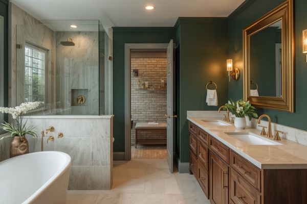
Rich emerald walls with brass fixtures and white marble counters.Why the All-White Bathroom Look Is Losing Its Appeal
Let’s talk about why white bathrooms aren’t as popular anymore. Here’s the thing. White bathrooms used to be the “safe” choice. And yes, they’re clean and practical. But they’re also kind of boring and cold. Like a doctor’s office.
In high-end homes today, people want more personality. They want their bathrooms to feel special…not sterile. Think about the last time you went to a nice hotel or spa. Were the walls plain white? Probably not.
Most luxury bathrooms use color to make you feel relaxed and pampered. And that’s exactly what we want for your bathroom. We want it to feel like your own personal retreat. A place where you can unwind after a long day.
The solution? Use unexpected paint colors that make your bathroom feel like a sanctuary. And there are three main ways to do this.
And there are three main ways to do this.
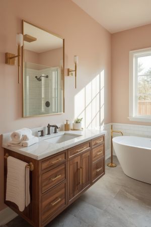
Soft blush walls with brass fixtures and natural wood create quiet sophistication.Path 1: Dark & Moody Paint Tones for Instant Sophistication
If you want instant sophistication and that custom spa feeling, look no further than rich, deep paint shades.
I’m talking about colors like deep forest green, rich navy blue, or even deep brown hues.
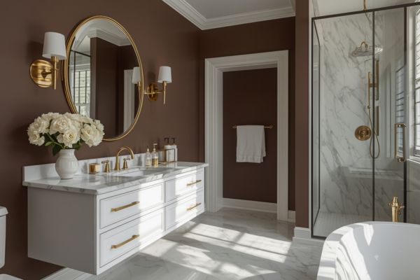
Deep chocolate brown walls with white vanity and brass fixtures create warmth without gloom.Why Dark Bathroom Colors Feel Luxurious and Expensive
Dark, moody tones are true powerhouses when it comes to sophisticated bathroom design.
Experts note that these darker paint colors bring an “unexpected but expensive touch” to a washroom. And here’s something interesting…you might worry that dark shades will shrink a small space.
But actually, they excel at creating an atmosphere of intimacy and sophistication.
Rich colors can cocoon the space in luxury, particularly in powder rooms. They shift the focus from the room’s physical size to its emotional feel.
Pretty cool, right?
But there’s more to it. These tones contribute to a luxury effect by fostering a deep sense of calm. This is thanks to biophilic design principles.
What’s that? Well, cool hues like deep greens and rich blues mimic calming natural elements…like forests and oceans. And these are clinically shown to reduce stress and promote restoration…much like a spa or wellness retreat.
So when you paint your lavatory a deep, moody shade, you’re not just making a design choice. You’re creating a healthier, more relaxing environment for yourself.
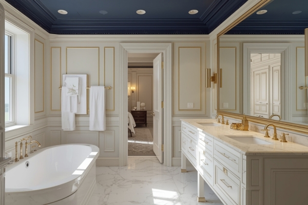
How to Use Navy Paint in Your Luxury Bathroom
Rich navy (like Sherwin-Williams Naval SW 6244) is incredibly versatile. It works in both traditional and contemporary bathrooms…and even in powder rooms.
But here’s the thing. To achieve its full opulent potential, dark colors demand high contrast.
So here’s what you need to do:
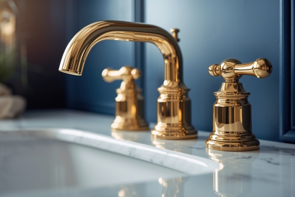
For a Classic Look: Pair navy paint with polished brass or gold hardware. This creates a refined, timeless aesthetic that never goes out of style. I absolutely love this combo.
For a Contemporary Feel: Choose matte black hardware instead. This gives you a sophisticated modern look that feels very current and upscale.
And here’s a critical tip. Use crisp white trim or white marble slabs (or white porcelain tile) to create elegance and prevent the space from feeling too heavy.
Trust me on this. The contrast is what makes the whole look work. Without it, the navy can feel oppressive instead of luxurious.
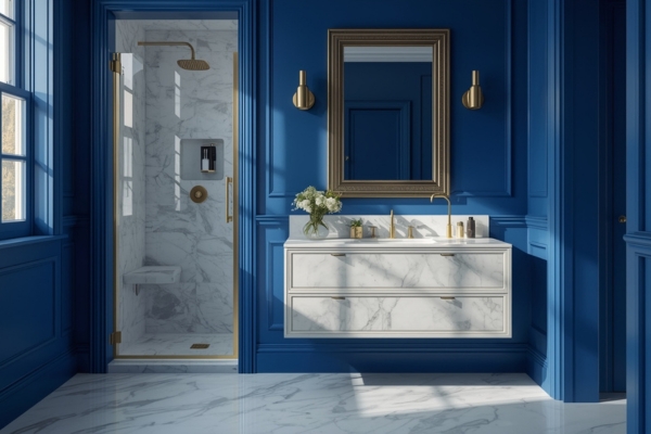
Navy: One of the Best Luxury Bathroom Colors
Rich navy (like Sherwin-Williams Naval SW 6244) is incredibly versatile. It works in both traditional and contemporary bathrooms…and even in powder rooms.
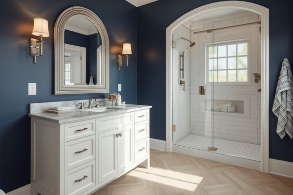
Navy walls paired with white vanity and trim create classic elegance.But here’s the thing. To achieve its full opulent potential, dark colors demand high contrast.
So here’s what you need to do:
For a Classic Look: Pair navy paint with polished brass or gold hardware. This creates a refined, timeless aesthetic that never goes out of style. I absolutely love this combo.
For a Contemporary Feel: Choose matte black hardware instead. This gives you a sophisticated modern look that feels very current and upscale.
And here’s a critical tip. Use crisp white trim or white marble slabs (or white porcelain tile) to create elegance and prevent the space from feeling too heavy.
Trust me on this. The contrast is what makes the whole look work. Without it, the navy can feel oppressive instead of luxurious.
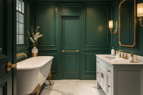
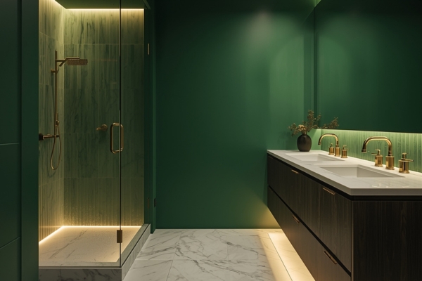
How to Use Deep Green Shades in Your Bathroom
A blackened forest green (like Benjamin Moore Backwoods 469) delivers a dramatic shade that “exudes luxury and class.”
I’ve seen this color in some stunning powder rooms and master baths…and it never fails to impress.
But here’s the thing. For deep forest greens, gold and brass fixtures are necessary to provide essential warmth.
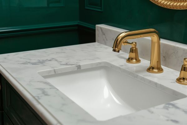
Notice how gold hardware warms up the green and makes it feel expensive.Without these warm metal tones, the hue can appear gloomy rather than rich and luxurious. So don’t skip this step.
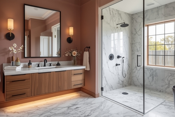
Deep Brown Paint for Upscale Bathroom Colors
Deep brown hues ( like Mississippi Mud – 2114-20 – Benjamin Moore) are another option for creating that moody, sophisticated vibe.
Rich brown walls need white marble and brass to feel luxurious instead of dark.These chocolate browns or espresso shades work especially well in bathrooms with natural wood elements or warm-toned tile. They create a cozy, enveloping feeling that’s perfect for a spa-like retreat.
Pair them with brass or copper fixtures for the ultimate warm, luxurious aesthetic.
Path 2: Soft, Muted Paint Hues for Quiet Sophistication
Not everyone wants drama in their bathroom. And that’s totally fine. If deep colors are too intense for you, muted luxury bathroom colors like dusty rose, blush pink (Pink Shadow – SW 0070 – Sherwin-Williams), or subtle peach offer an appealing path to elegance.
Natural wood vanity grounds the soft blush walls and adds warmth.These paint shades are all about “quiet sophistication.” They’re soft, they’re elegant, and they feel incredibly high-end when done right.
Creating an Organic, Tactile Feel with Soft Bathroom Colors
Here’s the secret to making soft colors feel luxurious.
You must pair them with raw, natural materials to achieve an organic, tactile feel. This is super important.
So think about it like this:
Pairing with Natural Elements: Soft pinks integrate beautifully with natural wood elements, stone countertops, and natural fibers.
For example, a pale peach wall gains depth when paired with a light wood vanity or woven basket accents. This results in “a warm and welcoming atmosphere” that feels expensive and curated.
Adding Texture: The use of zellige-inspired pink tile further enhances this tactile luxury. These tiles provide variations in shade that elevate the bespoke feel of the space.
If you’re not familiar with zellige tile, it’s a handmade Moroccan tile that has beautiful color variations. And it’s very popular in upscale bathroom design right now.
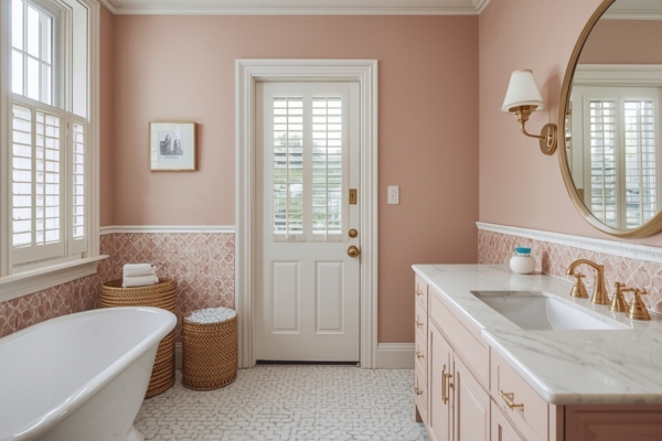
Zellige-inspired tile adds texture and color variation that makes blush feel sophisticated.Making Soft Paint Colors Look Grown-Up
Here’s where a lot of people get tripped up with soft luxury bathroom colors.
The goal is to make them feel calm and intentional — not pastel or overly sweet. To do that, you need contrast. I call it the Contrast Rule.
Add a Touch of Black:
If you’re working with soft pinks like Farrow & Ball’s Sulking Room Pink, pair them with something darker. Think black hardware, charcoal countertops, or deep wood accents. That bit of contrast gives the color more depth and makes the whole room feel balanced.
I’ve seen spaces completely change just by switching the hardware from silver to black. It grounds the color and suddenly feels more like a modern retreat than a room for kids.
Choose Metals That Add Warmth:
Brushed gold or brass is perfect with muted rose tones. It adds warmth and a quiet glow that feels elegant without being shiny or showy.
In short, soft paint colors need something to anchor them. That small dose of contrast keeps them grounded and makes the space feel finished — not flat.
Path 3: Jewel Tone Paint Colors for Maximum Visual Impact
Want to go all out? Then jewel tones are for you.
For maximum visual impact and glamour, choose jewel tones…rich, highly saturated hues like vibrant sapphire blue (like Valspar – Kate’s Ring – 8002-44G) , or emerald green.
These pigments are often infused with hints of black pigment, which gives them that deep, luxurious quality. And they create instant drama.
Creating a Luxury “Jewel Box” Bathroom Aesthetic
Jewel tones deliver instant opulence and create what designers call a “jewel box” aesthetic.
They’re perfect for small spaces like powder rooms or half baths. Why? Because they’re so visually striking, they eliminate the need to allocate budget toward expensive additional art or accessories.
The paint color itself becomes the decorative element…the structural jewelry of your space.
For example, sapphire blue tiles or cabinetry paired with gleaming gold fixtures can create a “regal, high-end feel.” I’ve seen this done in powder rooms and it’s absolutely stunning. Your guests will never forget it.
Pairing Jewel Tone Bathroom Colors with the Right Metals
To optimize their impact, metal pairings must be strategic. This is super important — get this wrong and the whole look falls flat.
For Warm Jewel Tones:
Gold and brass are essential for pairing elegantly with classic jewel tones like emerald green, sapphire blue, and ruby red. This combination delivers that timeless, high-end look designers love in luxury bathroom colors.
For Cool Jewel Tones:
Silver and polished chrome complement cooler jewel tones, such as amethyst and teal. The result is a sleek, modern aesthetic that feels clean and contemporary.
And here’s a critical tip: because jewel tones are so high-impact, they need to be balanced with strong neutral elements.
What do I mean? Use white marble counters, crisp white trim, or neutral console sinks. These serve as visual rest stops — giving your eye a calm place to land between the rich tones.
That balance is what keeps the color feeling rich and intentional rather than chaotic. You want people to say, “Wow, that’s stunning,” not “Wow, that’s a lot.”
Practical Tips for Applying Luxury Bathroom Paint Colors
Okay, so now you know which paint shades create luxury. But designing a luxe bathroom isn’t just about picking a pretty hue.
It’s about applying it thoughtfully. So let me share some practical tips that will make all the difference.
The Science of the Swatch: Testing Paint Colors for Light and Size
The selection process must begin with rigorous testing. And I mean it… don’t skip this step.
I can’t tell you how many people I’ve seen pick a paint shade they love at the store, only to hate it once it’s on their walls. The lighting in your bathroom is completely different than the lighting in a paint store.
So here’s what you need to do:
Always Sample Large Swatches: Test a large swatch directly on the wall. And I mean large… at least 12″ x 12″. Those little paint chips from the store don’t cut it.
Observe how the hue looks in morning sunlight versus evening artificial light. Colors can shift dramatically based on lighting.
That perfect navy might read almost black at night. Or that greige might show an unflattering greenish tint in certain light. You need to see it in your actual space before you commit.
Consider Light Exposure: The direction of natural light profoundly influences the outcome.
In north-facing rooms, the soft light dims colors, making dark paints appear deeper and cooler. In south-facing rooms, intense light makes dark paints appear more vivid.
Testing is the secret to getting luxury bathroom colors right — because the wrong lighting can make even the most elegant shade look flat.
Paint Samples Made Easy
It’s always best to test the paint colors in your own home and own lighting. The shades do look different depending on your lighting and can even look different room to room.
You can definitely go to your local painting store to buy some samples (and a brush… be sure to paint with 2 coats), but I have a MUCH EASIER way for you.
Check out Samplize. They offer 12″ x 12″ peel-and-stick paint samples that are easier, affordable, and more environmentally friendly. This is such a time saver. And you don’t have to worry about painting sample squares all over your bathroom walls.
Choosing the Right Paint Finish for Your Bathroom
Due to high humidity in bathrooms, the use of durable, mildew-resistant formulas is non-negotiable.
This is really important. Regular paint will peel, bubble, or develop mildew in a steamy bathroom. So don’t cheap out here.
Here are your options:
Semi-Gloss: This is the practical luxury standard. It’s highly durable, moisture-resistant, and easy to wipe down. Perfect for walls and ceilings in steamy baths.
This is what I recommend for most bathrooms. It’s the best combo of durability and style.
High-Gloss: This provides a dramatic, mirror-like shine. But it requires a flawless surface due to its reflectivity.
Any imperfections will show…so if your walls aren’t perfectly smooth, skip this option. But if they are? It can look absolutely stunning and very high-end.
Specialized Matte: For the pinnacle of understated luxury, specialized, moisture-resistant paints can achieve a sophisticated flat finish while retaining durability.
Benjamin Moore Aura Bath & Spa is a great example. It’s a matte finish that’s specifically formulated for bathrooms.
Strategic Placement for Maximum Bathroom Impact
Paint application must be strategic to amplify the luxe factor. Here are some ideas that go beyond just painting the walls — because how and where you apply luxury bathroom colors can make just as much of an impact as the shade itself.
Paint Beyond the Walls:
Extend your chosen color to unexpected surfaces. Consider painting a freestanding vanity cabinet or linen closet in your standout color. It becomes a stunning focal point.
An antique clawfoot tub can be painted a glossy black or emerald on its exterior for a bespoke look. I’ve seen this done and it’s absolutely gorgeous.
Try the Fifth Wall Strategy:
Paint the ceiling (the “Fifth Wall”) a deep, unexpected color like navy or rich burgundy.
This adds depth, drama, and a cozy, intimate feel. And it’s unexpected — which is what luxury is all about.
Alternatively, use a soft hue, such as a misty rose or a breezy blue, to draw the eye up. This can make the room feel more spacious.
Don’t Forget Accent Details:
Even small details matter. Accent paint at the back of shelves or niches provides depth and a custom touch.
This is a design trick that separates amateur bathrooms from professional-looking spaces.
Getting the Lighting Right in Your Luxury Bathroom
The chosen paint color cannot deliver luxury unless supported by an integrated lighting plan and balanced elements.
This is something people often overlook. But lighting can make or break your paint color choice.
Counteract Gloom: Lighting must actively counteract gloom, especially with dark paint shades.
In bathing areas, warmer ambient light (typically in the 2700K−3000K range) is necessary to enhance the cozy, spa-like atmosphere. Cooler light (like 4000K+) will make your bathroom feel like a doctor’s office. Not what we want.
Unconventional lighting, like indirect linear lighting installed beneath a raised vanity, helps to visually “lift” dark corners. This is a great trick for small bathrooms with dark walls.
Transform Your Ordinary Bathroom into a Luxurious Sanctuary
By choosing paint colors that truly speak to you and using them with intention, your bathroom can move beyond basic and feel genuinely luxurious.
Color is what sets the tone — it’s the detail that turns a simple space into something you look forward to every day.
Don’t shy away from richer shades or unexpected combinations. The right color can make even a small bathroom feel special.
And if you’re unsure? Order a few samples and test them out in your own lighting. Once you see the difference, you’ll realize how far thoughtful color can go.
Your bathroom doesn’t have to be ordinary — with the right color, it can feel luxurious and spa-like.
Want to see these ideas in action?
Watch the luxury bathroom color video on YouTube → Paint Colors That Make Your Bathroom Look EXPENSIVE
Looking for more inspiration?
Read: 5 Unique Paint Colors That Instantly Elevate Your Home in 2025